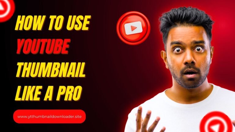
Thumbnails play a huge role when it comes to YouTube success. A great thumbnail can make the difference between a video being clicked on or ignored.
Many creators focus on titles, tags, and video quality but often forget about a simple strategy: learning from competitors’ thumbnails.
By analyzing what’s already working in your niche, a creator can design thumbnails that grab attention and improve video performance.
In this blog post, we’ll explore how to effectively analyze competitor thumbnails and apply these insights to create better-performing videos.
Why Thumbnails Matter More Than You Think
YouTube thumbnails act like the cover of a book—they influence the first impression. A strong thumbnail can:
- Increase click-through rates (CTR)
- Attract the right audience
- Communicate video value instantly
- Differentiate a video from dozens of similar ones
Because people decide in seconds whether to click, thumbnails often determine how far a video will go in YouTube’s algorithm. That’s why studying what your competitors are doing can be so powerful.
Step 1: Identify Your Real Competitors
Before analyzing thumbnails, it’s important to know who your real competitors are. Competitors aren’t just the biggest creators in a niche, but anyone who targets the same audience.
For example, if someone runs a cooking channel, their competitors could range from small recipe channels to big names like Tasty or Gordon Ramsay.
The trick is to identify the creators whose videos appear next to yours in search results or suggested videos. These are the thumbnails that your potential viewers are already comparing you to.
Step 2: Study Thumbnail Design Elements
Once the competition is clear, the next step is to examine their thumbnail designs. Pay close attention to:
- Colors: Are they using bright, bold colors, or do they stick with minimal tones?
- Text Style: Is text included? If yes, how large and readable is it?
- Faces and Emotions: Thumbnails with expressive faces often perform better. Are competitors using this trick?
- Composition: Do they zoom in on objects, food, or people, or keep it wide?
- Branding: Are they keeping a consistent style across all videos?
Noticing these patterns helps understand what viewers in the niche are drawn to.
Step 3: Compare CTR and Engagement Indicators
If someone wants to go deeper, they can use tools like TubeBuddy, VidIQ, or just YouTube Analytics.
These tools show metrics like click-through rate, impressions, and engagement. By comparing which thumbnails are performing better to those of competitors, a creator can see trends.
For example, maybe thumbnails with fewer words and stronger images perform better than cluttered ones. Or maybe light backgrounds attract more clicks than dark backgrounds.
Step 4: Look at Consistency vs. Experimentation
Some competitors maintain a consistent thumbnail style for branding, while others experiment with new designs regularly. Both strategies have benefits.
- Consistency helps viewers recognize videos instantly.
- Experimentation allows creators to test what works best.
By observing how competitors balance these strategies, a creator can decide whether to stick with a template or test multiple designs.
Also Read:
Step 5: Understand Audience Psychology
A powerful thumbnail doesn’t just look good; it taps into emotions. When analyzing competitors, ask:
- What emotions are their thumbnails triggering? Excitement, curiosity, fear of missing out?
- Are they leaving questions unanswered that push viewers to click?
- Do they use contrast and bold visuals to demand attention?
This psychological angle is often what separates a scroll-past thumbnail from a must-click one.
Step 6: Spot Common Mistakes
Sometimes, analyzing competitors reveals what not to do. A creator may notice thumbnails that are too cluttered, hard to read on small screens, or misleading compared to the video content. Avoiding these mistakes can help a channel stand out in a crowded feed.
Step 7: Apply and Test Insights
Once you’ve gathered all this information, it’s time to put it into action. The key is to apply competitor insights without directly copying them. A thumbnail should reflect the creator’s own brand while being inspired by proven designs.
Testing is key. Creators can create multiple versions of a thumbnail and compare the results. YouTube even allows for A/B testing with specific tools, making it easy to see which design performs best.
Real Example: Learning from Competitor Cooking Channels
Imagine a small cooking channel analyzing bigger competitors. They might notice:
- Bright, warm colors (reds, yellows) attract more clicks than dull tones.
- Thumbnails with close-ups of food perform better than wide shots.
- Text is kept minimal—just one or two words highlighting the dish.
- Competitors often show steam, sauce dripping, or action shots to create excitement.
By applying these insights, the small channel can design thumbnails that compete directly with established creators.
Also Read:
Final Thoughts
Analyzing competitor thumbnails is one of the best ways to improve video performance. This doesn’t mean copying designs — it means learning what works for your audience and adapting it with originality.
Thumbnails are a creator’s first impression, and in the competitive world of YouTube, first impressions often determine success.
By carefully studying competitors, understanding the psychology of design, and running tests, creators can create thumbnails that not only get clicks but also keep viewers coming back.


