When someone opens YouTube, the homepage is the first thing they see. It’s filled with videos competing for attention, and the thumbnail is usually the first detail that catches the eye.
A strong thumbnail can make the difference between a video being ignored or clicked on. Many successful creators agree that thumbnails are just as important as the content itself. Let’s explore how to design thumbnails that really stand out on the YouTube homepage.
Why Thumbnails Matter More Than Ever
Think of thumbnails as YouTube’s book covers. Even if a video has the most valuable content, viewers may never discover it if the thumbnail doesn’t spark curiosity.
On the YouTube homepage, where users scroll quickly and the choices are endless, a clear and eye-catching thumbnail becomes a powerful tool for attracting clicks.
A great thumbnail:
- Grabs attention in seconds
- Communicates the video’s topic instantly
- Encourages curiosity without being misleading
Keep It Simple and Clear
One of the most common mistakes creators make is overstuffing their thumbnails. Too many words, small details, or cluttered backgrounds can confuse viewers. A simple design with a clear theme works much better.
For example, if the video is about cooking pasta, showing a close-up of a delicious dish with just a few words like “Easy Pasta Recipe” is much more effective than text clutter, multiple images, or distracting elements.
Clarity always wins on the homepage because viewers usually make split-second decisions.
Use Bold and Readable Text
Adding a few words to the thumbnail can provide context and reinforce the title. However, the text should be bold, concise, and easy to read, even on small screens. Since many people use YouTube on their phones, small or fancy fonts are often unreadable.
Creators who succeed often stick to:
- 2–4 words only
- Bold fonts with high contrast
- Colors that stand out against the background
For example, using white text with a black outline ensures visibility whether the thumbnail is light or dark.
Also Read:
Choose High-Contrast Colors
Colors play an important role in grabbing attention. On the YouTube homepage, where many thumbnails sit side by side, bright and high-contrast colors naturally stand out.
Tips for effective use of colors:
- Use complementary colors (like blue and orange) to create balance.
- Avoid dull, washed-out shades.
- Stick to a consistent color theme for brand identity.
Some creators even choose one signature color for most thumbnails so their videos become instantly recognizable.
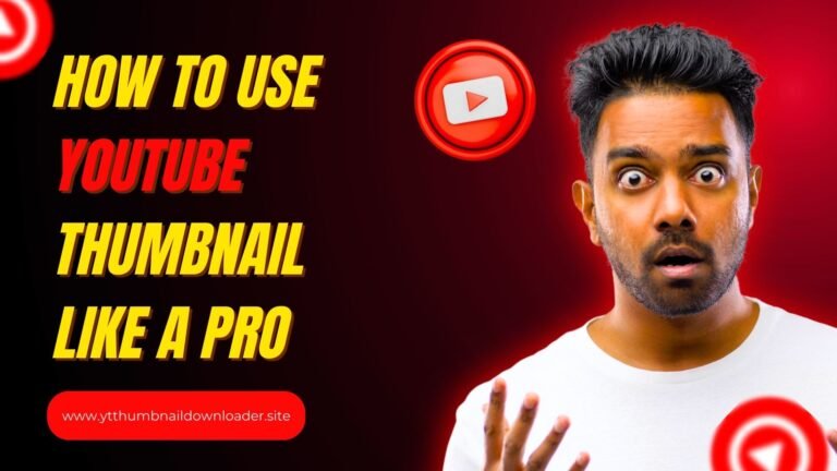
Show Emotions and Faces
Humans connect with emotion. Thumbnails featuring expressive faces perform better because viewers feel an immediate emotional connection. A smile, surprise, or curiosity on a person’s face can tell a story without words.
If the video doesn’t include people, adding elements with strong emotions (like an exciting conclusion, a shocking change, or a dramatic before-and-after shot) can achieve a similar effect.
Align the Thumbnail with the Title
A common reason viewers skip videos is that the thumbnail and title don’t match. If the title promises “how to save money fast,” but the thumbnail shows random images without context, viewers can’t trust the content.
To avoid this, thumbnails should support and reinforce the video title. At the same time, they should provide a clear reason to click. Misleading thumbnails may drive short-term clicks, but they damage credibility in the long run.
Add Curiosity Without Clickbait
A good thumbnail makes viewers curious enough to click, but it shouldn’t feel like clickbait. The goal is to tease the content, not trick the audience.
For example:
- A thumbnail with a before-and-after picture makes viewers wonder, “How did they achieve that?”
- A blurred object with a bold question mark can spark curiosity without being misleading.
When done right, curiosity drives clicks while still keeping the promise of value in the video.
Maintain Consistency for Branding
Big creators often follow a consistent style for all of their thumbnails. Whether it’s the color theme, font style, or layout, this consistency helps viewers instantly recognize their videos. Over time, consistent thumbnails build trust and a strong personal brand on YouTube.
This doesn’t mean that every thumbnail has to look the same, but having a consistent structure ensures a professional appeal and brand recognition.
Test and Improve Over Time
Not every thumbnail will perform well on the first try. YouTube offers analytics tools like click-through rate (CTR) to measure effectiveness. By comparing different styles and designs, creators can learn what resonates most with their audience.
A/B testing thumbnails is another great way. Uploading two different versions and testing which one performs better provides actionable insights into audience preferences.
Also Read:
Final Thoughts
Thumbnails aren’t just images – they’re powerful invitations to click. On the YouTube homepage, where competition is fierce, the right thumbnail can make a video stand out from the hundreds of options.
By keeping designs clear, using bold text, choosing high-contrast colors, showing emotion, and being consistent, creators can dramatically improve their chances of getting noticed.
For anyone serious about growing on YouTube, investing time in thumbnail design is a great strategy. After all, the journey to more views often starts with a single click – and that click starts with a standout thumbnail.